This post uses OAUTH1.0 to access the Fitbit API. I've now "upgraded" to using OAUTH2.0. Click here for a how-to guide.
The data in the JSON response to the Fitbit API looks like this in it's raw format:
u'minuteData': [{u'value': u'2', u'dateTime': u'22:14:30'}, {u'value': u'1', u'dateTime': u'22:15:30'}, {u'value': u'1', u'dateTime': u'22:16:30'}, {u'value': u'1', u'dateTime': u'22:17:30'}
...and when I process it into a summary file it looks like this:
2015-01-27,22:21:00,3
2015-01-27,22:22:00,2
2015-01-27,22:23:00,2
2015-01-27,22:24:00,2
2015-01-27,22:25:00,2
2015-01-27,22:26:00,1
2015-01-27,22:27:00,1
2015-01-27,22:28:00,1
So the first value is the date, the second value is the time and the third value is the sleep state value logged by Fitbit. Looking at the API documentation it states these are:
- 1 is asleep
- 2 is awake
- 3 is really awake
| Value | API Doc Says | Fitbit App says |
| 1 | Asleep | Asleep |
| 2 | Awake | Restless |
| 3 | Really Awake | Awake |
I analysed data for the period 27/02/2015 until 19/04/2015 which was 39,030 data points. Breaking this down by result type I got:
| Value | Count | Percentage |
| 1 | 35,208 | 90.2% |
| 2 | 3,224 | 8.3% |
| 3 | 598 | 1.5% |
So I spend more than 90% of my time in bed asleep. This is a good thing!
I was most interested in the times that my Fitbit says I am awake; specifically analysing times when I'm awake at night when I'd rather be asleep! Over a couple of nights, when answering the call of nature, I satisfied myself that the times when Fitbit said I was awake, I actually was awake.
So taking the raw output and putting it into Excel I:
- Just looked at data points with a sleep value of "3" (so awake).
- Just looked for the time period midnight to 05:00 (as there's bound to be lots of 3s at bed time and getting up time).
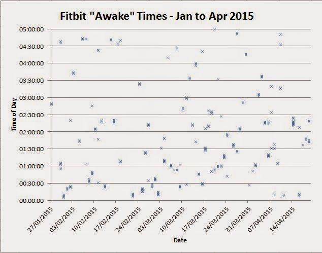
Taking this filtered data and plotting it a graph with the date on the x-axis and time of day on the y-axis I got this chart:
Now I'm not the greatest at interpreting graphs like this but I thought there was a definite clustering at the bottom of the graph. This is highlighted below:
But there was only one way to prove it! A histogram showing the frequency of the times when I'm awake. Using half hour buckets I got:
So 19.8% of the times I was awake during the night was during the period Midnight to 00:30:00. Scanning the table, it's clear to see that there's a much higher frequency of me being awake during the midnight to 02:30:00 period than from 02:30:00 until 05:00:00. A graph makes this clear to see:
I think there's a relatively simple explanation for this pattern. I tend to wake up each and every night to answer the call of nature (after having previously done so just before bed) and this act is reflected in the higher frequency of being awake for the first 2.5 hours after midnight. I'm then able to settle down for a relatively solid sleep for the next 2.5 hours.
So far, so reasonably interesting (for Geeks). At the start of this month we swapped from UTC to British Summer Time in the UK so I thought it would be interesting to see what impact this had on my "call-of-nature" induced wake-up time. Specifically, would the clocks going forward an hour shift my wake up pattern? This would tell me whether my night time visits to the smallest room were body clock driven or just time elapsed since my last drink.
It's been 21 days since daylight saving time was introduced so I just picked out data 21 days either side of this point. This gave me this chart when date and time of day are plotted:
To me it does look like there's a cluster of points later in the night after daylight saving time was introduced. Again, let's do a frequency analysis and plot the results on a chart:
The chart is interesting, if not conclusive:
- There's been a massive drop in the frequency of being awake during the 00:30:00 to 01:00:00 period.
- There's been a massive spike in the frequency of being awake in the 02:00:00 to 02:30:00 period.
Looking back at the previous chart, I would say the 02:30:00 spike is down to just a single day, 14/04/2015 when I was awake for 15 minutes during the night. I would say that the number of data points (135 in total) is not enough to draw a conclusion, being too easily skewed by one anomalous night.
I might just sharpen up my stats skills and have another look at this to see if something of statistical significance can be observed. All tips put in the comments section below are welcomed!!


No comments:
Post a Comment