I was idly scanning some charts from the Fitbit mobile app when I spotted this one and had a geek idea!

This shows my heart rate over the course of 2015 and early 2016, as measured by my Fitbit Charge HR. I set to wondering why it had the profile shown, i.e. starts reasonably low in early 2015, rises and peaks in mid 2015 then drops again in late 2015 through to early 2016. The theory here is that my resting heart rate is getting lower as I get fitter. So why am I getting fitter?
My quest for truth (well the 4 minutes I thought about it) made me recall this chart I created for a previous blog post.

This shows my step count over the period and I put down the variation to how much running I was doing at the time. Not comfortable with such a loose coupling of vague recollected half truths, I set about gathering some data to try and prove (or dis-prove) that there was a correlation.
So three sources of data to compare and contrast:
- Fitbit steps data (via Fitbit API).
- Fitbit heart rate data (via Fitbit API).
- Strava exercise data (via Strava API).
Part 1 - Compare Step Data with Strava Running Data
I used the same technique to get Strava API data as I used in this post. You can extract data from the API and put it in a R data frame using these commands:
> library(jsonlite)
> stravadata <- fromJSON('https://www.strava.com/api/v3/activities?access_token=<your key here>&per_page=200&after=1422748800',flatten=TRUE)
Here "1422748800" is the Unix epoch timestamp for 2015-02-01 which I obtained using this site.
Get just running data using this command:
> stravadata_run <- stravadata[grep("Run", stravadata$type), ]
Get just date, name and distance using:
> stravadata_run_simple <- stravadata_run[,c(11,5,6)]
...which yields (abridged):
> stravadata_run_simple
start_date name distance
1 2015-02-01T09:25:19Z Old Skool Farley Mount Run 11893.7
6 2015-02-07T09:03:36Z Winchester Parkrun 20150207 5044.2
9 2015-02-15T09:05:19Z Mildly Moist & Muddy Up Somborne and Farley Mount Run 12290.7
Now to compare with my monthly step data I need to aggregate this into monthly Strava data (with distance summed).
> stravadata_run_simple$DistanceInt <- as.numeric(stravadata_run_simple$distance)
> stravadata_run_simple$TimePosix <- as.POSIXct(stravadata_run_simple$start_date)
> stravadata_run_simple_agg_sum <- aggregate(list(Distance = stravadata_run_simple$DistanceInt), list(Month = cut(stravadata_run_simple$TimePosix, "month")), sum)
The first two commands above turn the date into a Posix date object and the distance into a number whilst the third does the aggregation.
This yields:
> stravadata_run_simple_agg_sum
Month Distance
1 2015-02-01 34044.6
2 2015-03-01 15302.4
3 2015-04-01 33326.7
4 2015-05-01 51032.4
5 2015-06-01 29983.8
6 2015-07-01 22940.9
7 2015-08-01 4650.9
8 2015-09-01 15166.1
9 2015-10-01 17009.7
10 2015-11-01 34529.1
11 2015-12-01 57782.0
12 2016-01-01 87035.6
13 2016-02-01 10552.2
I can easily trim the extra data row for 2016-02-01 using:
> stravadata_run_simple_agg_sum <- stravadata_run_simple_agg_sum[-c(13),]
Which means "remove row 13 and leave all the columns in place".
So now I have this and my monthly total step data which is:
> stepdata_2015_agg_sum
month Steps tenthoublocks footsteps
1 2015-02-01 350767 35.0767 35
2 2015-03-01 385209 38.5209 39
3 2015-04-01 385578 38.5578 39
4 2015-05-01 477423 47.7423 48
5 2015-06-01 391484 39.1484 39
6 2015-07-01 375393 37.5393 38
7 2015-08-01 373952 37.3952 37
8 2015-09-01 379701 37.9701 38
9 2015-10-01 417465 41.7465 42
10 2015-11-01 290259 29.0259 29
11 2015-12-01 434621 43.4621 43
12 2016-01-01 442431 44.2431 44
Meaning I can form a data frame with step and run distance data using:
> strava_and_steps <- stravadata_run_simple_agg_sum
> strava_and_steps$Steps <- stepdata_2015_agg_sum$Steps
...yielding (abridged):
> strava_and_steps
Month Distance Steps
1 2015-02-01 34044.6 350767
2 2015-03-01 15302.4 385209
3 2015-04-01 33326.7 385578
4 2015-05-01 51032.4 477423
5 2015-06-01 29983.8 391484
I'm not a stats expert but a bit of reading shows that R contains some built in correlation functions. The simplest being:
> cor(strava_and_steps$Distance,strava_and_steps$Steps)
[1] 0.4801041
This is saying a coefficient of correlation of 0.48. A number of sites, including this one state the following interpretation of the coefficient of correlation.
| Value of r | Strength of relationship |
|---|---|
| -1.0 to -0.5 or 1.0 to 0.5 | Strong |
| -0.5 to -0.3 or 0.3 to 0.5 | Moderate |
| -0.3 to -0.1 or 0.1 to 0.3 | Weak |
| -0.1 to 0.1 | None or very weak |
Now to draw a graph to see if I can spot any correlation. I need to plot two series on the graph and for this I learned about melting using the reshape library and then about plotting melted data.
To melt:
> install.packages("reshape")
> library(reshape)
> melted_data <- melt(strava_and_steps, id=c("Month"))
...which yields:
> melted_data
Month variable value
1 2015-02-01 Distance 34044.6
2 2015-03-01 Distance 15302.4
3 2015-04-01 Distance 33326.7
4 2015-05-01 Distance 51032.4
5 2015-06-01 Distance 29983.8
6 2015-07-01 Distance 22940.9
7 2015-08-01 Distance 4650.9
8 2015-09-01 Distance 15166.1
9 2015-10-01 Distance 17009.7
10 2015-11-01 Distance 34529.1
11 2015-12-01 Distance 57782.0
12 2016-01-01 Distance 87035.6
13 2015-02-01 Steps 350767.0
14 2015-03-01 Steps 385209.0
15 2015-04-01 Steps 385578.0
16 2015-05-01 Steps 477423.0
17 2015-06-01 Steps 391484.0
18 2015-07-01 Steps 375393.0
19 2015-08-01 Steps 373952.0
20 2015-09-01 Steps 379701.0
21 2015-10-01 Steps 417465.0
22 2015-11-01 Steps 290259.0
23 2015-12-01 Steps 434621.0
24 2016-01-01 Steps 442431.0
So effectively taking the side-by-side data frame and turning it into a longer list with "variable" defining whether the data element is a Steps value or a Distance value.
This can then be easily plotted using:
> ggplot(data = melted_data, aes(x = Month, y = value, color = variable)) +
geom_point()
Which yields:

...which is kind of OK but not that useful as the Distance values are an order of magnitude lower than the Steps values, meaning their variances are somewhat lost.
I learnt it's better to plot two linked charts using something called facets.
The command is:
> ggplot(data = melted_data, aes(x = Month, y = value, color = variable, group=1)) + facet_grid(variable ~ .,scales="free_y") + geom_line()
Here the facet_grid(variable ~ . means split "variable" vertically and leave the horizontal axis as is and scales="free_y" means make the scale on the Y axis independent of each other.

I like the graph a heck of a lot but can I spot any correlation from it?
- Months that correlate: May, Jun, Jul, Oct, Dec, Jan
- Months that don't correlate: Feb, Mar, Apr, Aug
- Outliers: Nov as my Fitbit stopped working for part of it so I "lost" steps.
Which probably shows why the statistical correlation was only "moderate".
Part 2 - Compare Heart Rate Data with Strava Running Data
I obtained monthly average resting heart rate data using my Raspberry Pi, the OAUTH2.0 method I explained in this post and the URL below:
https://api.fitbit.com/1/user/-/activities/heart/date/2016-01-31/1y.json
The data looked like this (abridged):
pi@raspberrypi ~/fitbit $ sudo more 2015_heart.json
{"activities-heart":[{"dateTime":"2015-02-01","value":{"customHeartRateZones":[],"heartRateZones":[{"caloriesOut":1731.78528,"max":90,"min":30,"minutes":1012,"name":"Ou
t of Range"},{"caloriesOut":1178.0111,"max":126,"min":90,"minutes":265,"name":"Fat Burn"},{"caloriesOut":404.61594,"max":153,"min":126,"minutes":32,"name":"Cardio"},{"c
aloriesOut":387.18186,"max":220,"min":153,"minutes":28,"name":"Peak"}],"restingHeartRate":67}},{"dateTime":"2015-02-02","value":{"customHeartRateZones":[],"heartRateZone
After transferring the data to my PC I opened up R and loaded the JSON using this command:
> library(jsonlite)
> stepdata2015 <- fromJSON(file.choose(),flatten=TRUE)Where file.choose() means the Windows file chooser form is opened to allow you to select the JSON file. The data looked messy so I transformed it into a data frame using this:
> heartdata2015_df <- as.data.frame(heartdata2015)
Then I could select the data I wanted (date and heart rate) using this to get just one row:
> heartdata2015_df[c(1),c(1,4)]
activities.heart.dateTime activities.heart.value.restingHeartRate
1 2015-02-01 67
...and could just put this data into it's own data frame by doing (i.e. all rows and just columns 1 and 4):
> heartdata2015_df_simple <- heartdata2015_df[,c(1,4)]
> heartdata2015_df_simple
activities.heart.dateTime activities.heart.value.restingHeartRate
1 2015-02-01 67
2 2015-02-02 67
3 2015-02-03 67
4 2015-02-04 68
Then I could summarise it into monthly average data by doing:
> heartdata2015_df_simple$TimePosix <- as.POSIXct(heartdata2015_df_simple$activities.heart.dateTime)
> heartdata2015_df_simple$HeartInt <- as.integer(heartdata2015_df_simple$activities.heart.value.restingHeartRate)
> heartdata_2015_agg_mean <- aggregate(list(Heart = heartdata2015_df_simple$HeartInt), list(month = cut(heartdata2015_df_simple$TimePosix, "month")), mean)
The first two commands create proper date fields and integer fields from the JSON derived data and the third does the aggregation. This yields (abridged):
> heartdata_2015_agg_mean
month Heart
1 2015-02-01 68.14286
2 2015-03-01 69.19355
3 2015-04-01 68.36667
I did a simple line plot using:
I did a simple line plot using:
> ggplot(data=heartdata_2015_agg_mean, aes(x=month,y=Heart,group=1)) + geom_line()
...which yields this graph:
 Even though the time base is different and the Fitbit derived graph (see top of post) has smoothing applied the points on this graph do match those on the Fitbit derived graph.
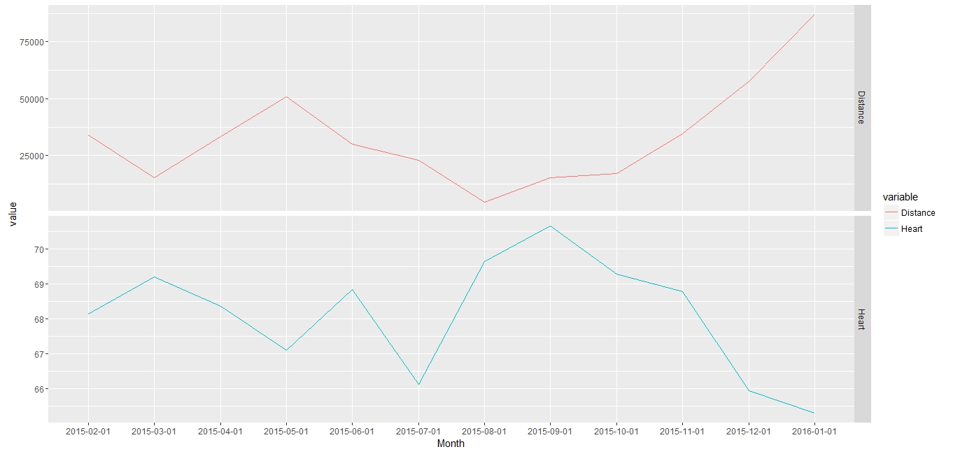
I merged the Strava distance and heart rate data using:
> strava_and_heart <- stravadata_run_simple_agg_sum
> strava_and_heart$Heart <- heartdata_2015_agg_mean$Heart
Yielding:
> strava_and_heart
Month Distance Heart
1 2015-02-01 34044.6 68.14286
2 2015-03-01 15302.4 69.19355
3 2015-04-01 33326.7 68.36667
4 2015-05-01 51032.4 67.09677
5 2015-06-01 29983.8 68.83333
6 2015-07-01 22940.9 66.12903
7 2015-08-01 4650.9 69.65217
8 2015-09-01 15166.1 70.66667
9 2015-10-01 17009.7 69.29032
10 2015-11-01 34529.1 68.78261
11 2015-12-01 57782.0 65.93548
12 2016-01-01 87035.6 65.29032
First let's correlate:
> cor(strava_and_heart$Distance,strava_and_heart$Heart)
[1] -0.8061387
Now we're talking! A strong negative correlation! As distance goes up, heart rate comes down. Love it.
So to melt (melted heart - geddit!!):
> melted_heart <- melt(strava_and_heart, id=c("Month"))
> melted_heart
Month variable value
1 2015-02-01 Distance 34044.60000
2 2015-03-01 Distance 15302.40000
3 2015-04-01 Distance 33326.70000
4 2015-05-01 Distance 51032.40000
5 2015-06-01 Distance 29983.80000
6 2015-07-01 Distance 22940.90000
7 2015-08-01 Distance 4650.90000
8 2015-09-01 Distance 15166.10000
9 2015-10-01 Distance 17009.70000
10 2015-11-01 Distance 34529.10000
11 2015-12-01 Distance 57782.00000
12 2016-01-01 Distance 87035.60000
13 2015-02-01 Heart 68.14286
14 2015-03-01 Heart 69.19355
15 2015-04-01 Heart 68.36667
16 2015-05-01 Heart 67.09677
17 2015-06-01 Heart 68.83333
18 2015-07-01 Heart 66.12903
19 2015-08-01 Heart 69.65217
20 2015-09-01 Heart 70.66667
21 2015-10-01 Heart 69.29032
22 2015-11-01 Heart 68.78261
23 2015-12-01 Heart 65.93548
24 2016-01-01 Heart 65.29032
...and to facet:
> ggplot(data = melted_heart, aes(x = Month, y = value, color = variable, group=1)) + facet_grid(variable ~ .,scales="free_y") + geom_line()
...yielding this chart:

The only outlier is July where distance went down and heart rate went down. Maybe I did a lot of cycling and swimming in July? Other than that you can pretty much see the correlation.
Conclusion
...which yields this graph:

I merged the Strava distance and heart rate data using:
> strava_and_heart <- stravadata_run_simple_agg_sum
> strava_and_heart$Heart <- heartdata_2015_agg_mean$Heart
Yielding:
> strava_and_heart
Month Distance Heart
1 2015-02-01 34044.6 68.14286
2 2015-03-01 15302.4 69.19355
3 2015-04-01 33326.7 68.36667
4 2015-05-01 51032.4 67.09677
5 2015-06-01 29983.8 68.83333
6 2015-07-01 22940.9 66.12903
7 2015-08-01 4650.9 69.65217
8 2015-09-01 15166.1 70.66667
9 2015-10-01 17009.7 69.29032
10 2015-11-01 34529.1 68.78261
11 2015-12-01 57782.0 65.93548
12 2016-01-01 87035.6 65.29032
First let's correlate:
> cor(strava_and_heart$Distance,strava_and_heart$Heart)
[1] -0.8061387
Now we're talking! A strong negative correlation! As distance goes up, heart rate comes down. Love it.
So to melt (melted heart - geddit!!):
> melted_heart <- melt(strava_and_heart, id=c("Month"))
> melted_heart
Month variable value
1 2015-02-01 Distance 34044.60000
2 2015-03-01 Distance 15302.40000
3 2015-04-01 Distance 33326.70000
4 2015-05-01 Distance 51032.40000
5 2015-06-01 Distance 29983.80000
6 2015-07-01 Distance 22940.90000
7 2015-08-01 Distance 4650.90000
8 2015-09-01 Distance 15166.10000
9 2015-10-01 Distance 17009.70000
10 2015-11-01 Distance 34529.10000
11 2015-12-01 Distance 57782.00000
12 2016-01-01 Distance 87035.60000
13 2015-02-01 Heart 68.14286
14 2015-03-01 Heart 69.19355
15 2015-04-01 Heart 68.36667
16 2015-05-01 Heart 67.09677
17 2015-06-01 Heart 68.83333
18 2015-07-01 Heart 66.12903
19 2015-08-01 Heart 69.65217
20 2015-09-01 Heart 70.66667
21 2015-10-01 Heart 69.29032
22 2015-11-01 Heart 68.78261
23 2015-12-01 Heart 65.93548
24 2016-01-01 Heart 65.29032
...and to facet:
> ggplot(data = melted_heart, aes(x = Month, y = value, color = variable, group=1)) + facet_grid(variable ~ .,scales="free_y") + geom_line()
...yielding this chart:
The only outlier is July where distance went down and heart rate went down. Maybe I did a lot of cycling and swimming in July? Other than that you can pretty much see the correlation.
Conclusion
- There is a moderate postive correlation between step count and distance run.
- There is a strong negative correlation between distance run and average heart rate.
No comments:
Post a Comment